I've spent the last few days working on the colour development for my project. The initial inspiration has come from the artist Alexandra Pacula who creates oil painting of urban night life. These are some of her paintings:
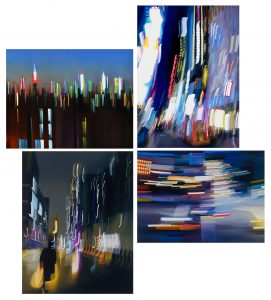
(images taken from www.alexandrapacula.com)
Inspired by these I took my own images of light movement at night. They ranged from images of shows, buildings, traffic and light displays but were all taken in a way that distorts the original subject so the colour becomes the focus. These are a few of the photos I have been working on:
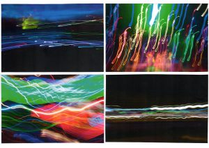
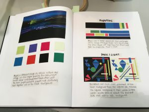
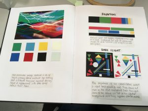
From these images I took the main 8 colours that were in each and analysed them looking at the tones, proportion and how they would compare on their current dark background if I were to swap it with the lightest colour/white. There were a range of colours that came through however there were similarities in some shades such as reds and blues. Further development and analysis will help to determine which of these if any will bee the most fitting for my final palette.
Whilst doing this I also researched designer from my intended market to see what colours they were current using and came across Mary Katrantzou's latest resort collection.
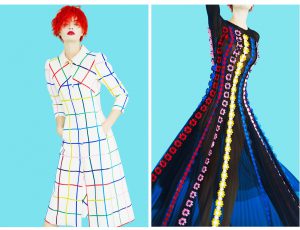
(Images taken from www.vogue.com)
The Primary colours are quite similar to those from my initial ideas showing that these bright colours are being used in high-end fashion. There were also similarities with the predicted spring/summer 18 colours on WGSN. It was pointed out to me however that I needed to be careful with my research as I need to be working beyond trends and not within them. This was not actually my intention, the research was simply to show that the colours that I am developing could work within commercial fashion. As a result of this feedback I need to make this clear that I am designing ahead of any predicted trends and not working to what has already been done/predicted for the coming seasons.
Leave a Comment