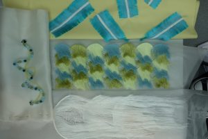
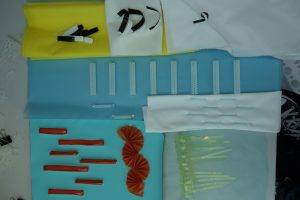
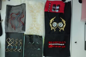
I was unsure about how each collection was going so I decided to group them again and see how they had developed. I was surprised to see some had developed a lot more than others for example the first collection had 3 final samples on the way where as the others were mainly development ideas. It also gave me the opportunity to see what was missing and if anything else needs to be bought into them. Doing this has enabled me to form a plan for each collection going forward to address the issues and continue building them.
Collection 1
The samples are coming along well and reflect the aesthetic I want this collection to have. I need to make sure I finish the samples completely before I start to make more so that I don't end up with lots of half finished pieces. There is a lot of fringing so far so I need to look at other techniques to pull into this collection and re look at the layout of the top frayed sample. The collection is starting to give a sense of movement and has a light feminine aesthetic. I also haven't used any purple in this collection so far and need to see where or if I can bring it in or, whether the palette needs re looking at.
Collection 2
Theres a lot of blue in this collection and no pink or purple yet. I need to design how I am going to use the thermochromic printing ink of these colours to tie it in with the collection. There is a lot of 3D and manipulation in the this collection so I need to look at what other techniques can be bought into it. I also need to start developing these into final design samples to make sure they are not forgotten about as ideas. I have changed the green in this palette to a brighter shade which I felt helped to add to the fun, energetic nature of the collection.
Collection 3
This collection needs the most development as it is lacking in design ideas. I have decided from this to revisit my initial photographs from Paris to look at the details and gather some more motif ideas to explore. This collection is going in the direction of having a mix of illustrative designs and large embellishments that use the rich colours to interpret the light movement images. I'm hoping to be able to tie these all together through colour and using similar techniques across the digital embroidery ideas. There are a lot of dark colours so far in this collection, mainly black, so more colour needs to be introduced.


Leave a Comment